
When an airline company contacted us to help them find their buyer persona with non-traditional data like flight and contact information with the help of Machine Learning (ML), we knew exactly what they needed to do. Airline companies are one of the biggest industries that have access to various kinds of data from multiple sources. They are experts in customer service thanks to years of providing successful loyalty programs. However, neither large nor small airlines are currently taking advantage of the load of data stored in their servers.
In a recent McKinsey report, it was found that as consumers around the globe adjust to the next normal, there is a significant variance in consumer sentiment and behaviors across countries. That raises the question, do you know who your new and shifted business's buyer personas are? And if so, how much do you know about them now that Covid-19 is our new reality?
Clustering is one of the fastest ways to find the answer–– It mines your data to find clusters in large data sets, finding similarities and differences between them, then groups similar data into sets. It can be used for image segmentation, grouping web pages, market segmentation, information retrieval, shopping behavior, fraud detection, and more.
It’s a handy way to make sense of your data and use it to proactively grow your business—but it also comes with some disadvantages. You’ll have to extract and centralize your data, not to mention learning how to use PySpark’s clustering algorithms. And you’ll need to define the number of clusters needed, which can result in a time-consuming process, one that can hurt your company with incorrect conclusions if a statistical or knowledge-backed method is not used in building your data sets. That’s why it often seems easier to just ignore the new data and not put it to work. Or in this case, as Hubspot puts it
Conduct research, surveys, and interviews — all with a mix of customers, prospects, and those outside your contacts database who might align with your target audience.
Even though that’s a great way to find your buyer persona, it can only be achieved with demographical data, and it’s labor-intensive, especially during a pandemic, and add to that the fact that you will only be interviewing and analyzing a small chunk of your customer database, and the information gathered wouldn’t be tied to their behavior, such as what they do when they are in the process of using your product. Naturally, having a faster, more effective way of doing things results in a win-win not only for the marketing specialist behind the strategy but also for the company as a whole.
But you might be asking yourself, so how do I even go about that? Maybe you just have a small team of analysts and implementing ML models seems far out of reach for you. Or you lead an enterprise with teams of data scientists but you need to iterate and put ML model outputs into production, fast. We hear you, and that’s why No-Code tools like Datagran exist. No-Code tools are typically easy-to-use because of their simplicity, like drag and drop visual editors to build ML workflows, a process that otherwise could take weeks, months if not years to accomplish, depending on the complexity.
Datagran’s No-Code app lets you centralize multiple data sources in a single place and run ML models with PySpark algorithms like clustering and others with little to no code, in minutes. Then, you can send the results to your favorite business applications like Intercom, Facebook Ads, Salesforce, and more, or export them into a CSV file to import into any other app. It can even be sent via API or Webhook for total flexibility.
Here’s how to find your buyer’s persona from your company’s non-traditional data.
Clustering Algorithm Tutorial:
First, integrate the data sources you want to extract data from
Datagran can import data from a wide range of data warehouses and sources, including databases like PostgreSQL, Azure Cosmos DB, Snowflake, and more, along with business software including HubSpot, Shopify, Facebook Ads, Salesforce, Segment, Amplitude, and more.
For this example, we will use two SFTP data sources to pull in customer service ticket data with information such as ticket number, type of ticket, the reason for the call, and so on. And customer data like name, email address, phone number. To do so, just drag and drop the SFTP data source from the right-hand menu onto the canvas. Click here to learn how to integrate data sources into your Datagran account.
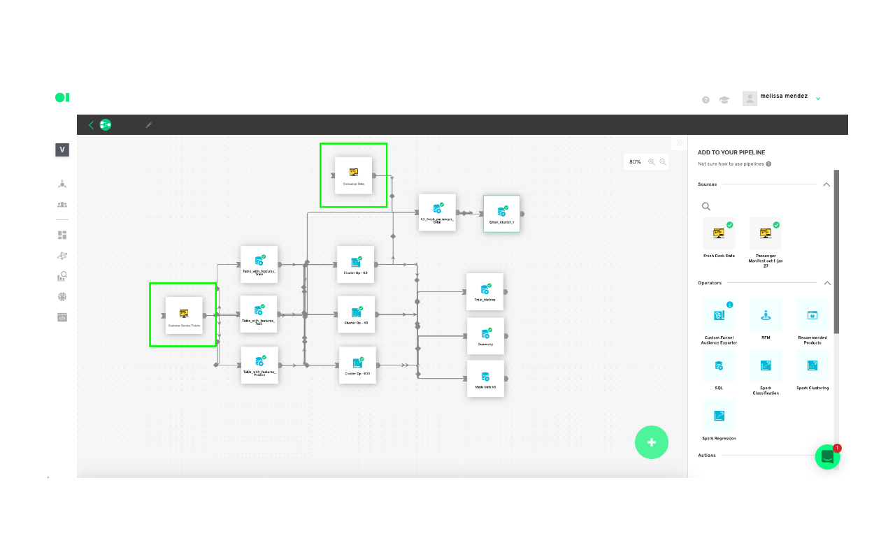
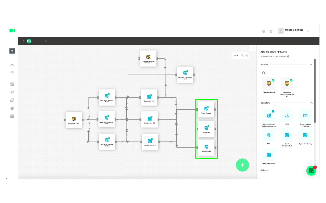
Then, create a new pipeline—what Datagran calls its workflows—to process your data.
Now, drag and drop three SQL operators into the pipeline canvas—we will be using one for training, one for tests, and one for predictions.
Let’s get ML working on your model. First, train the dataset:
In this step, you will extract the data (columns) which will be used from the SFTP customer service ticket data source. This will let the machine know exactly the information it needs to work on. To learn more about operators, watch this video.
Tip: We suggest using 90% of the data set for training, and 10% of the data set for testing.
To train the model you need a set of data to train the algorithms (train dataset). If you want to evaluate the model, you need a set of test data (test dataset), although it is not mandatory. And finally, the objective is the output of the model (100% of the data set), the values you want Datagran to predict. For this, it is necessary to have a dataset for prediction (predict dataset).
Hover over the first operator element which will be named Train and press the edit button. The SQL query editor page will pop-up where you can choose what columns to pull from your data. Copy and paste the query snippet example below and replace each variable to apply to your table’s variables, or press the Show Editor button located on the top right-hand corner to choose the columns without having to add code. Then, run
SELECT
Column_1,
Column_2,
Column_3,
Column_4,
Column_n
WHEN
State = ’Closed’
FROM
Data_source
WHERE
RAND() <= 0.9
Second, test the dataset:
Drag and drop a second SQL operator into the canvas. Click the Edit button and name the second SQL element Test. Copy and paste the dummy query inside of the SQL canvas. Again, this is only an example, you must replace the query’s column variables with your own.
SELECT
X0_column,
X1_column,
X2_column,
X3_column,
X4_column,
Xn_column
FROM
Dataset
WHERE
RAND() < 0.1
The third step is to run your predictions:
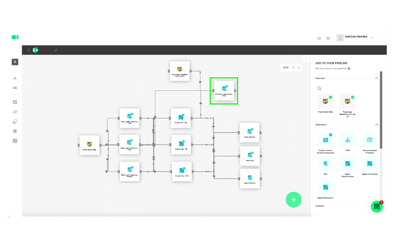
In this case, you don’t want to predict from the information being pulled in the future, but what the data is telling you from the information you currently have on your customer service tickets so you can ultimately find out who is our buyer persona. This SQL will run with 100% of the data. What you will find out with this query is who are the customers who for example, flew in X flight, with X number of pieces of luggage and what cluster he/she belongs to. Then, you will connect the results to the other data source containing passenger information.
Drag and drop a third SQL operator into the canvas. Press the edit button and name it Predict. Copy and paste the dummy query below and replace the column variables with your own.
WITH predict_table
AS
(SELECT
X0_column,
X1_column,
X2_column,
X3_column,
X4_column,
Xn_column
FROM
Data_source AS t1),
con_table
AS
(SELECT
*,
CONCAT(Document_number, "**", Email-address, "**", Flight_number, "**", Ticket_ID)
AS Id_table
FROM
predict_table )
SELECT
*
FROM
con_table
Run the SQL operators:
For all three SQL elements to activate the play button must be pressed. Simply hover over each element to find it.

Connect flight information to customers’ information to find your buyer persona.
Now you need to merge flight information to your customer’s information to find out which cluster has the highest value and then determine the group of customers who have the greatest probability of flying with you. The result of the model consists of various charts which can be visualized in our chart section. Or, you can also send the output of your model to any of our available actions such as Facebook Ads, API, Webhook, Salesforce, and more. The process is the same as on the SQL elements above: edit, choose the tables, save the results and run the element by clicking the play button.
Model configuration:
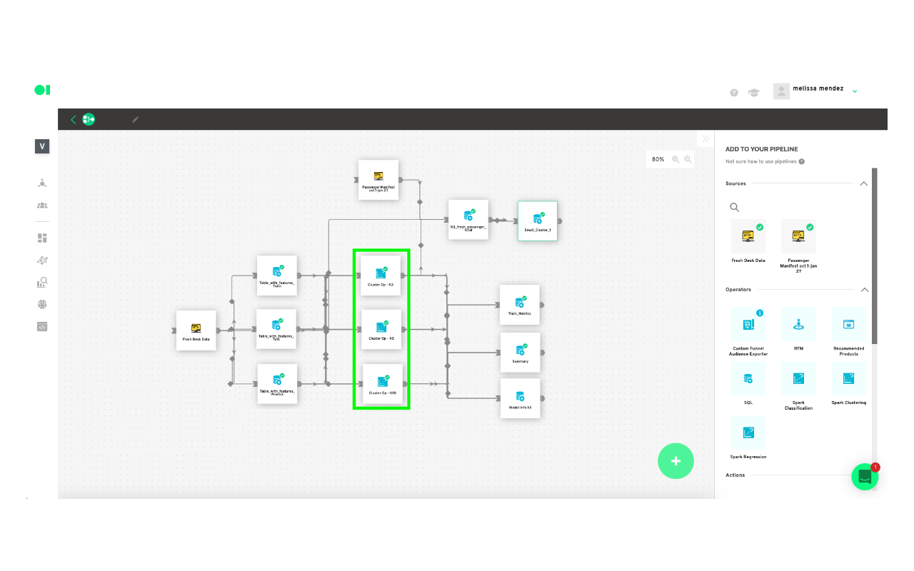
You will now run your first Clustering Operator using one of the available clustering algorithms, such as Gaussian Mixture, Bisecting K-Means, or K-Means.
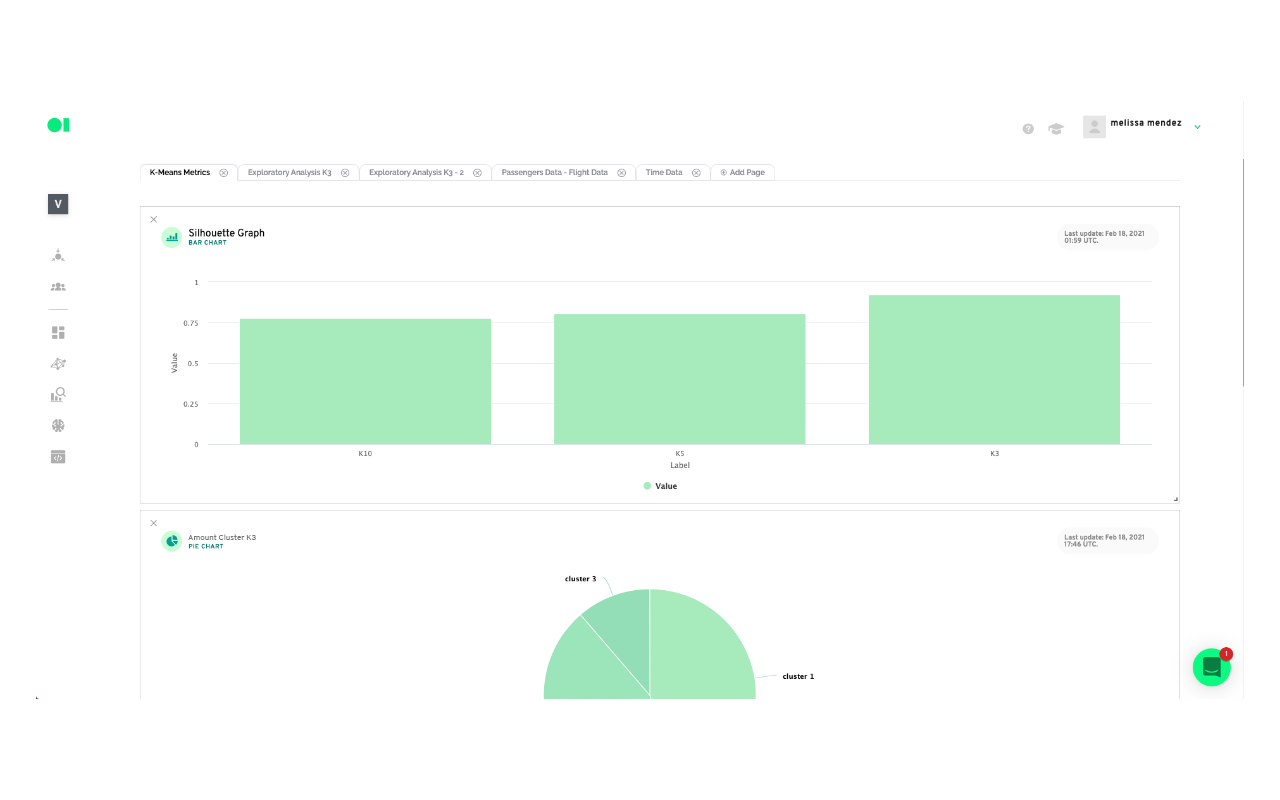
For this example, you will run three tests with K-Means clustering, varying the value of k in each. Name them K3, K5, and K10. The cluster with the highest value will be considered your most valuable cluster which can be used for further analysis.
Drag the three Clustering Operators located in the right-hand side panel, and drop them into the canvas. Connect the three SQL operators to them, and then hover over each Clustering element, and press edit. Choose the variables for each drop-down menu for all of the Clustering elements. When you’re done, hover over the elements and press play to run the algorithms.
Check your clusters’ content with charts:
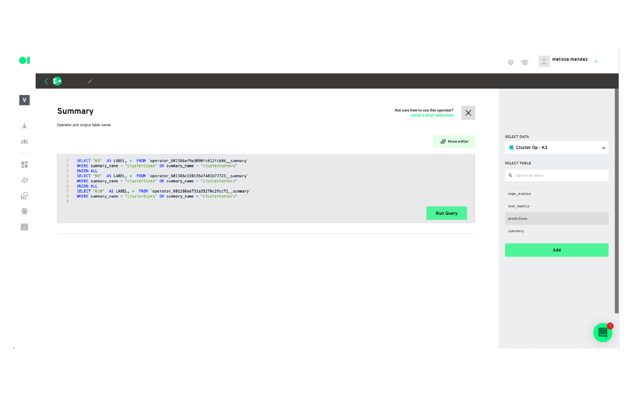
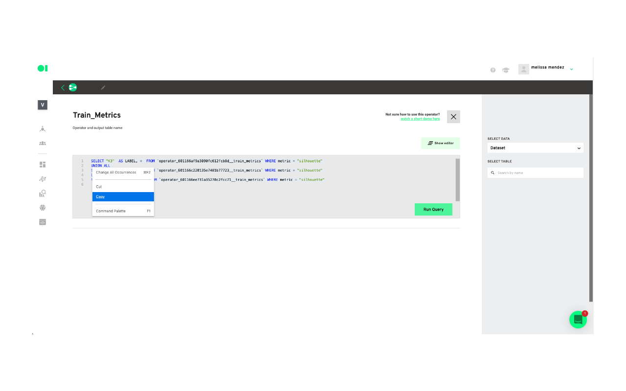
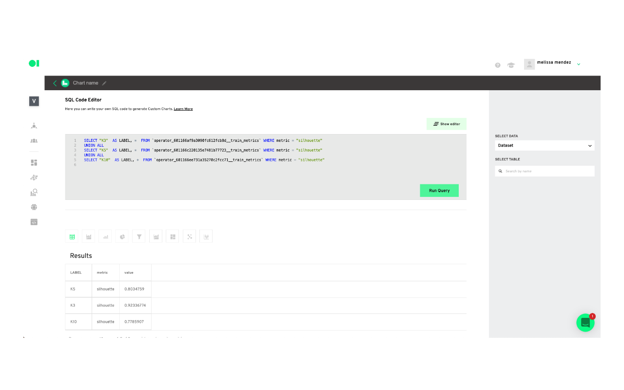
Add a last SQL element to the canvas. This SQL will have a query you can use to create a chart which will be your visualization tool. In this example, the K3 cluster had the best results so you need to click the edit button, once the pop-up window appears name the element Train_metrics and select the cluster K3 and then the table within that cluster you need to visualize. In this case, you can choose Summary. You can repeat this process to visualize the other clusters.

Create a new chart:
To visualize a chart, copy and paste the query inside of the elements.
Go to the chart section and create a new chart.
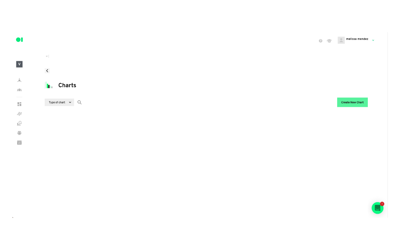
Paste the query inside of the canvas and run it.
Scroll down and save or Save as a block to visualize it in your boards section.
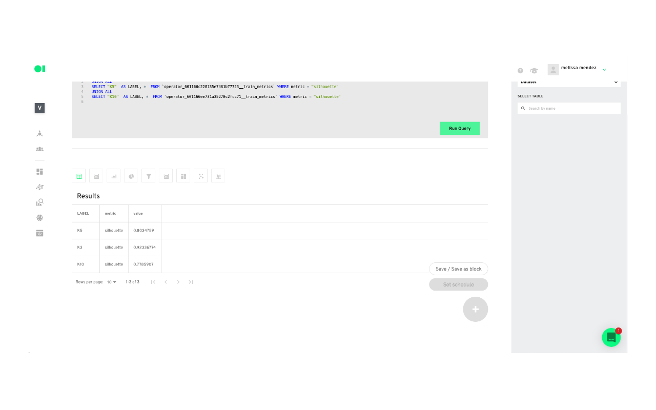
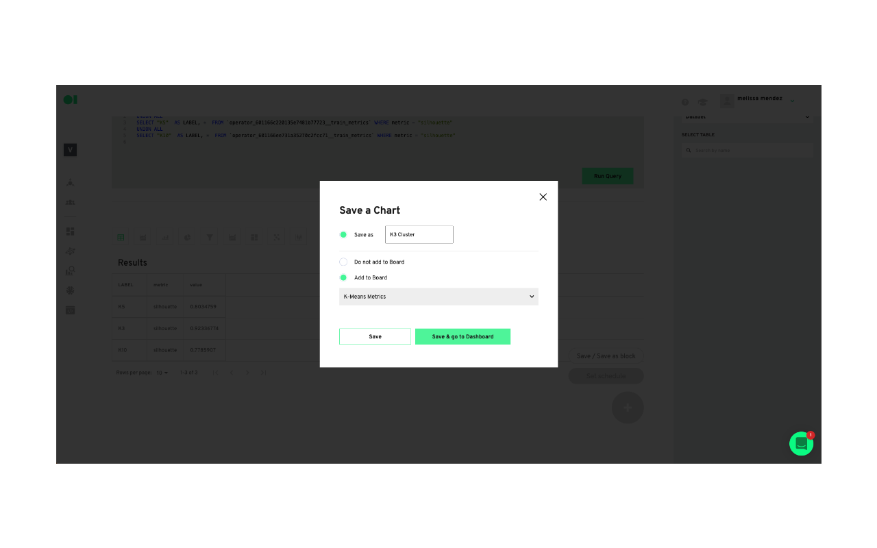
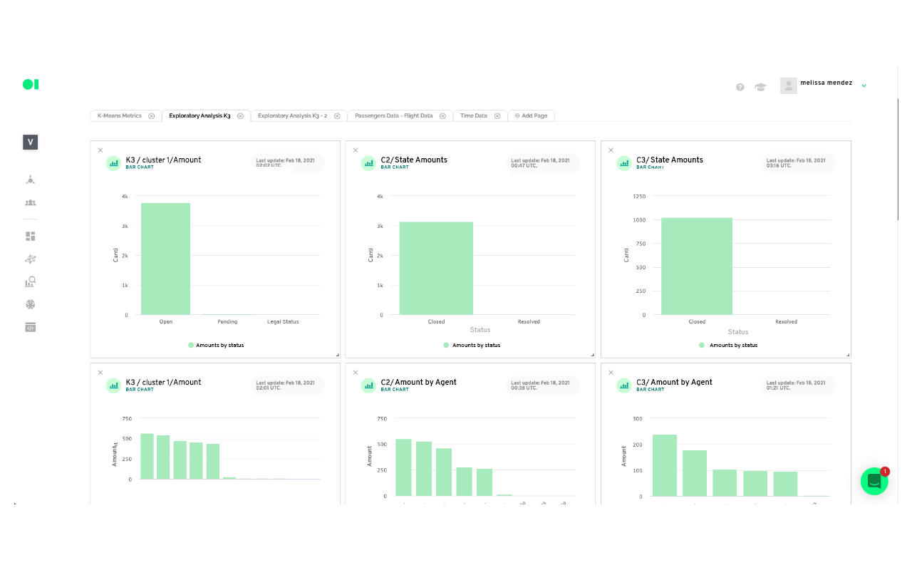
Now you can visualize your cluster's results in an easy-to-read chart you can share with stakeholders by heading over to Boards.
There are more options for further analysis you can create from the outcome of your cluster model. For example:
Based on the results
Cluster 1: We can conclude that cluster number 1 has the requests of passengers who mostly did not board flights (this could be because they were canceled). That their customer service tickets are open and pending, therefore they do not have a resolution time as well as a resolution status. Additionally, these tickets are the ones with the longest expiration date and their type of request includes all reimbursement. The first two numbers of flights can be associated with roundtrip flights, so it could be assumed that there was an issue associated with these flights. This cluster is based exclusively in 17 flights.
Cluster 2: This cluster determines that these are passengers who mostly boarded their flights, and who have closed customer service tickets with the resolution times between the first 4 days of initial contact. The customer service tickets are divided between those who comply and those who don’t with the Service Agreement, with those who don’t comply with a higher number. The type of request includes those of Itinerary News, and they had minimal interaction with an agent and a resolution time of around 3 days. In this cluster we could also find a round trip which implies a problem with the 7 flights included possibly due to cancellation or delay.
Cluster 3: This cluster is the smallest compared to the other two and comprises passengers who have generally boarded the flights, their respective customer service tickets are in a closed state and their entire resolution status does not comply with the Service Agreement. It has had at least one interaction with an agent with a tendency to 2 interactions and the resolution times include the highest values, around 53 days, but a shorter expiration time compared to the rest of the clusters. This cluster has exclusively 9 flights.
Put your ML model results into production:
Drag and drop an Action element API Exporter into the canvas or a Facebook Custom Audience to create an ad campaign with your results.
Actions allow you to send the Pipeline’s output into a specific business application. One of the main challenges businesses face is how to put ML models into production, fast. To use Actions, simply drag and drop your favorite application, eliminating the need to worry about set up on each specific platform. Standard destinations can be Google Sheets or BigQuery. Some Apps could be Campaign Monitor, Twilio, Facebook Ads or Google Ads. For example, the Mailchimp Action triggers emails based on the results of the previous operators.
Datagran easily lets you run clustering algorithms with little to no effort, thanks to our pipeline visual editor. You can set up your model, experiment to see the results you get, then connect other data sources and use the same tools to mine that data for insights that can help your business.
Do you need to make higher-level models? Try out our other Spark algorithms for Regression and Classification, and segment your data based on specific attributes like shopping behavior with RFM analysis, Recommended Product analysis, and more.

.jpg)

